Who This Is For
This article is for beginners who have already made one simple ggplot and now want to answer a very common question: how do I show the distribution of one variable correctly? The focus here is not on making beautiful charts yet. It is on learning which plot type matches which kind of variable.
What You Will Do
- Use
geom_bar()for a categorical variable. - Use
geom_histogram()for a numeric variable. - Use
geom_density()when you want a smoother view of shape. - Learn how
bins,fill, andalphaaffect readability.
Before You Start
- You should already understand the
ggplot(data = ..., aes(...)) + geom_*()pattern. - You need
ggplot2andpalmerpenguins. - You should know the difference between a categorical variable and a numeric variable.
The companion script for this article is:
R draw/scripts/02-ggplot-from-zero-distributions.R
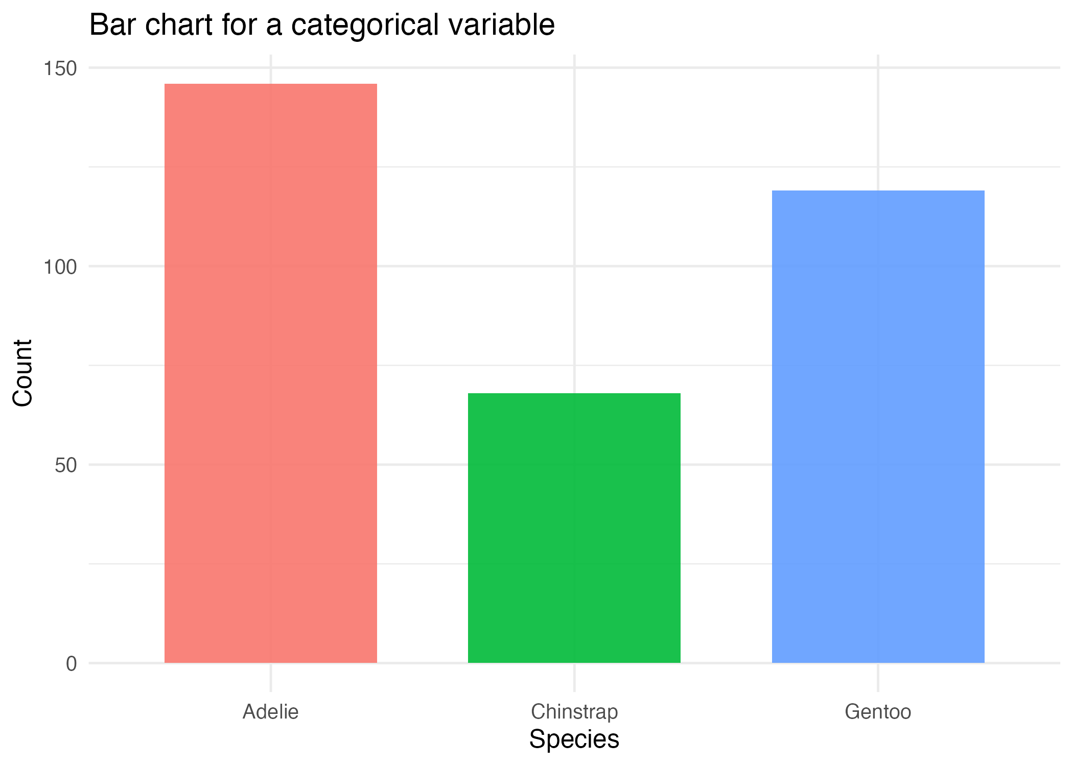
Step 1: Use a Bar Chart for a Categorical Variable
When the variable itself is a group label such as species or island, a bar chart is usually the right starting point.
ggplot(penguins_clean, aes(x = species, fill = species)) +
  geom_bar()
geom_bar() counts rows for you. That is why you only map x here and do not provide a numeric y.
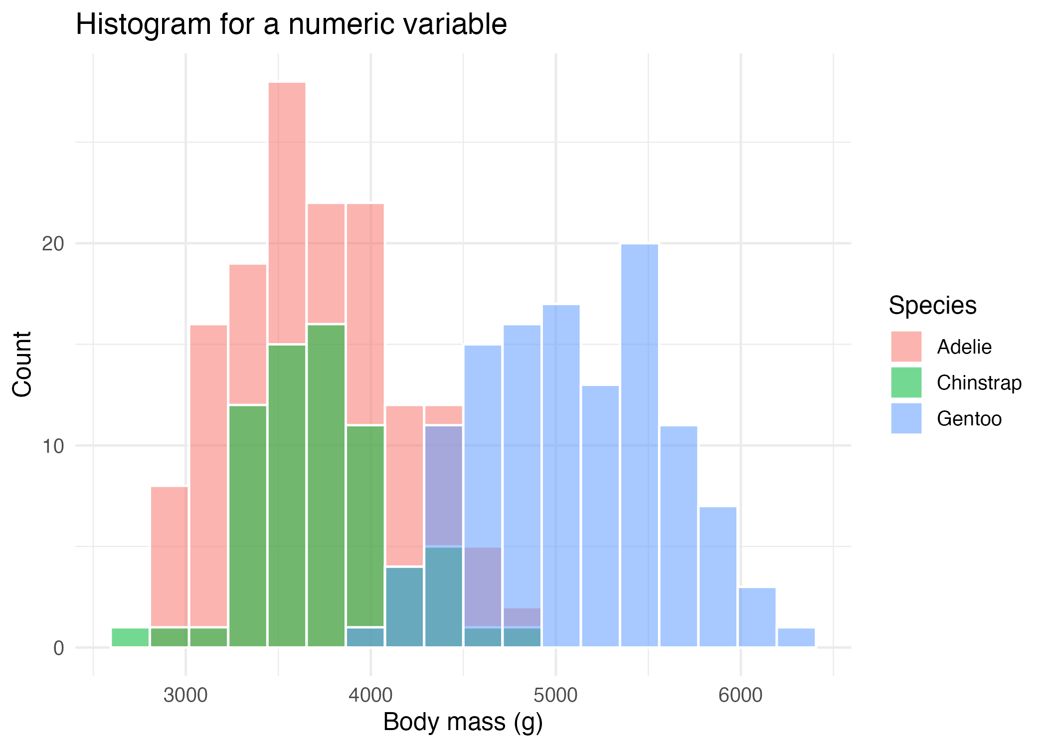
Step 2: Use a Histogram for a Numeric Variable
If your variable is numeric, such as body mass, you usually want a histogram instead.
ggplot(penguins_clean, aes(x = body_mass_g, fill = species)) +
  geom_histogram(
    bins = 18,
    alpha = 0.55,
    position = "identity",
    color = "white"
  )
Important parameters here:
binscontrols how many intervals the data is split into.alphacontrols transparency.position = "identity"overlays groups instead of stacking them.color = "white"draws a visible outline between bins.
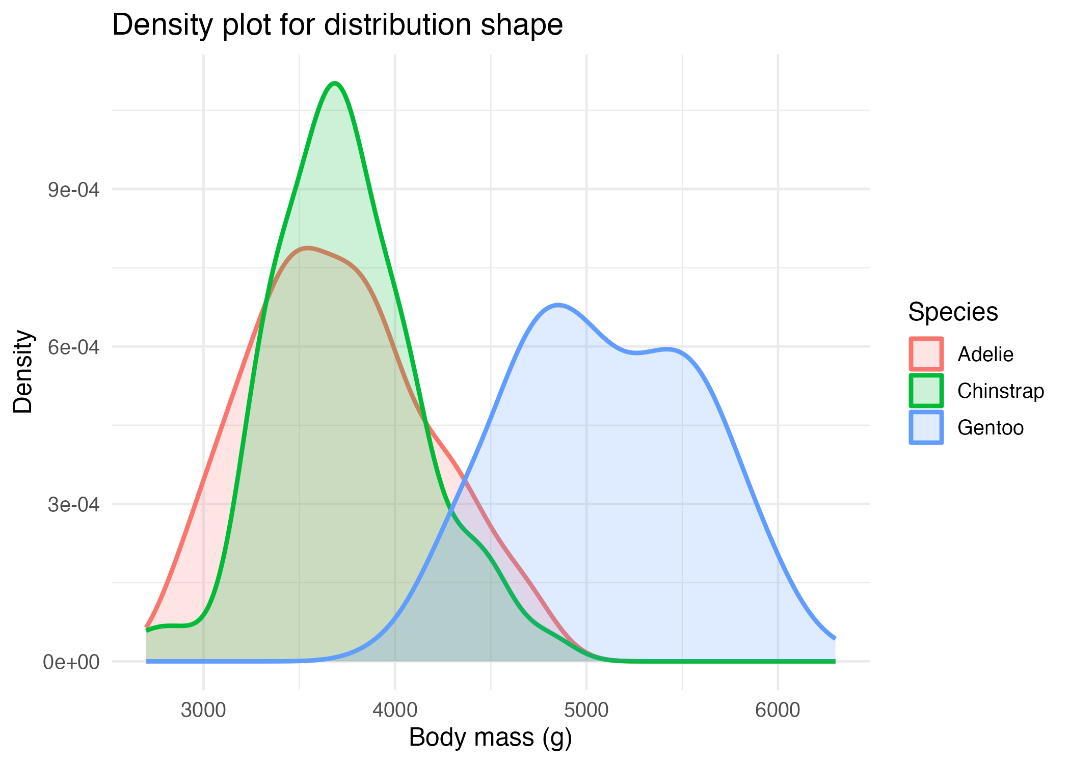
Step 3: Use a Density Plot for a Smoother Shape
Histograms are discrete because they use bins. Density plots are smoother, which can make overall shape easier to compare across groups.
ggplot(penguins_clean, aes(x = body_mass_g, color = species, fill = species)) +
  geom_density(alpha = 0.2, linewidth = 1)
This does not replace histograms forever. It simply gives you another lens on the same question.
Step 4: Choose the Plot Based on the Variable Type
Use this simple rule:
- if the variable is categorical, start with
geom_bar() - if the variable is numeric, start with
geom_histogram() - if you want a smoother comparison of numeric distributions, try
geom_density()
That rule alone will prevent many beginner plotting mistakes.
How to Confirm It Worked
- Your script creates:
R draw/figures/02-distribution-bar.pngR draw/figures/02-distribution-histogram.pngR draw/figures/02-distribution-density.png
- You can explain why
speciesuses a bar chart andbody_mass_guses a histogram or density plot.
Common Questions
Why not use a bar chart for numeric data?
Because bar charts are best for counts of categories, not for showing how numeric values are distributed across a range.
How do I choose the right number of bins?
Start with the default or a moderate value such as 15 to 30, then adjust and compare. Too few bins hide structure. Too many bins add noise.
When is a density plot a bad choice?
Density plots can be less intuitive for absolute counts, especially for readers who are very new to statistics. Histograms are often easier to explain first.
Review Score
Score: 92/100 Verdict: This draft is ready for human review and gives a clear beginner path for single-variable distributions.
Show Explanation
Score Breakdown
- Accuracy: 23/25. The article matches standard ggplot usage for bar, histogram, and density plots.
- Beginner friendliness: 24/25. The “variable type decides plot type” rule is simple and useful.
- Reproducibility: 23/25. The companion script and figure files make the workflow easy to rerun.
- Professional judgment and risk handling: 22/25. The article keeps the choices realistic, though a later appendix could mention frequency polygons as another option.
Review Notes
- Ready for human review.
- Before publication, consider adding one sentence about when overlaid histograms become visually too crowded.
```
Personnel
- ✍ Creator: Chenglin Cai
- 🤖 AI Collaboration: ChatGPT
- 🧪 Data Provider: palmerpenguins package dataset
- 💻 Code Contributor: ChatGPT