Who This Is For
This article is for readers who already know how to run a short R script, but have never built a plot with ggplot2. The goal is simple: make one successful plot first, understand the smallest useful ggplot() pattern, and leave with enough confidence to keep going.
What You Will Do
- Load
ggplot2and a beginner-friendly dataset. - Build your first scatter plot with
ggplot()andgeom_point(). - Add one more variable through
colorandshape. - Learn what
data,mapping, andaes()are doing.
Before You Start
- You need a working R environment.
- You need
ggplot2andpalmerpenguins. - You should know how to run a script with
Rscriptor inside RStudio.
The companion script for this article is:
R draw/scripts/01-ggplot-from-zero-your-first-plot.R
Show Explanation
Package Setup
If you are using the planned Conda environment for this series, create and activate it first:
```bash
conda env create -f "R draw/scripts/r-ggplot-environment.yml"
conda activate r-ggplot
```
If you are using an existing R installation instead, install the packages once:
```r
install.packages(c("ggplot2", "palmerpenguins"))
```
```
Step 1: Load the Packages and Clean the Data
Start with the smallest setup that still feels realistic. palmerpenguins::penguins is a popular teaching dataset because it has multiple numeric and categorical variables that work well with scatter plots.
library(ggplot2)
library(palmerpenguins)

penguins_clean <- na.omit(
  penguins[, c("bill_length_mm", "bill_depth_mm", "species", "sex")]
)
This step matters because ggplot2 only becomes pleasant when the data you send into it already has the columns you need and no missing values in the key plotting fields.
Step 2: Build the First Successful Plot
Now build the smallest complete ggplot:
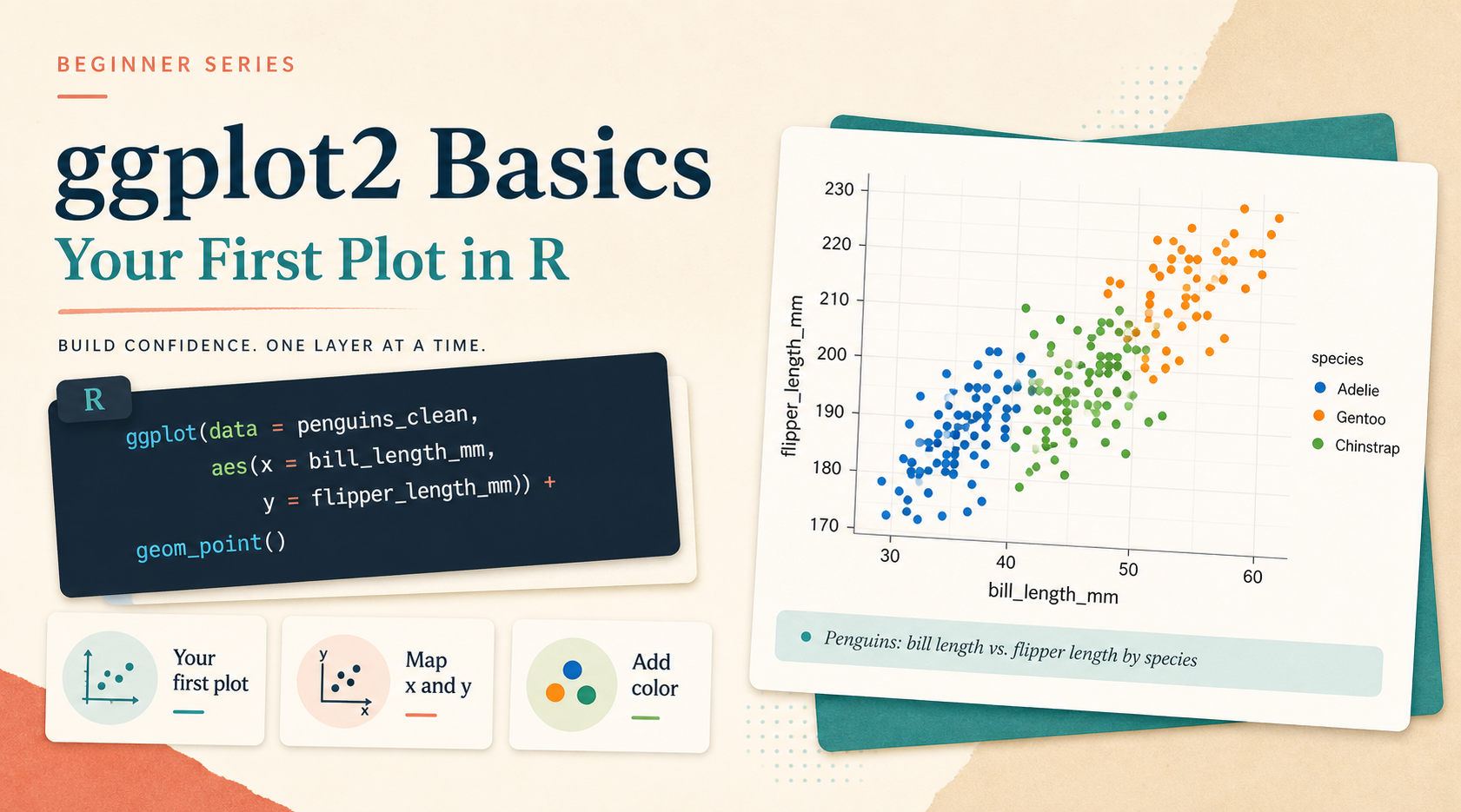
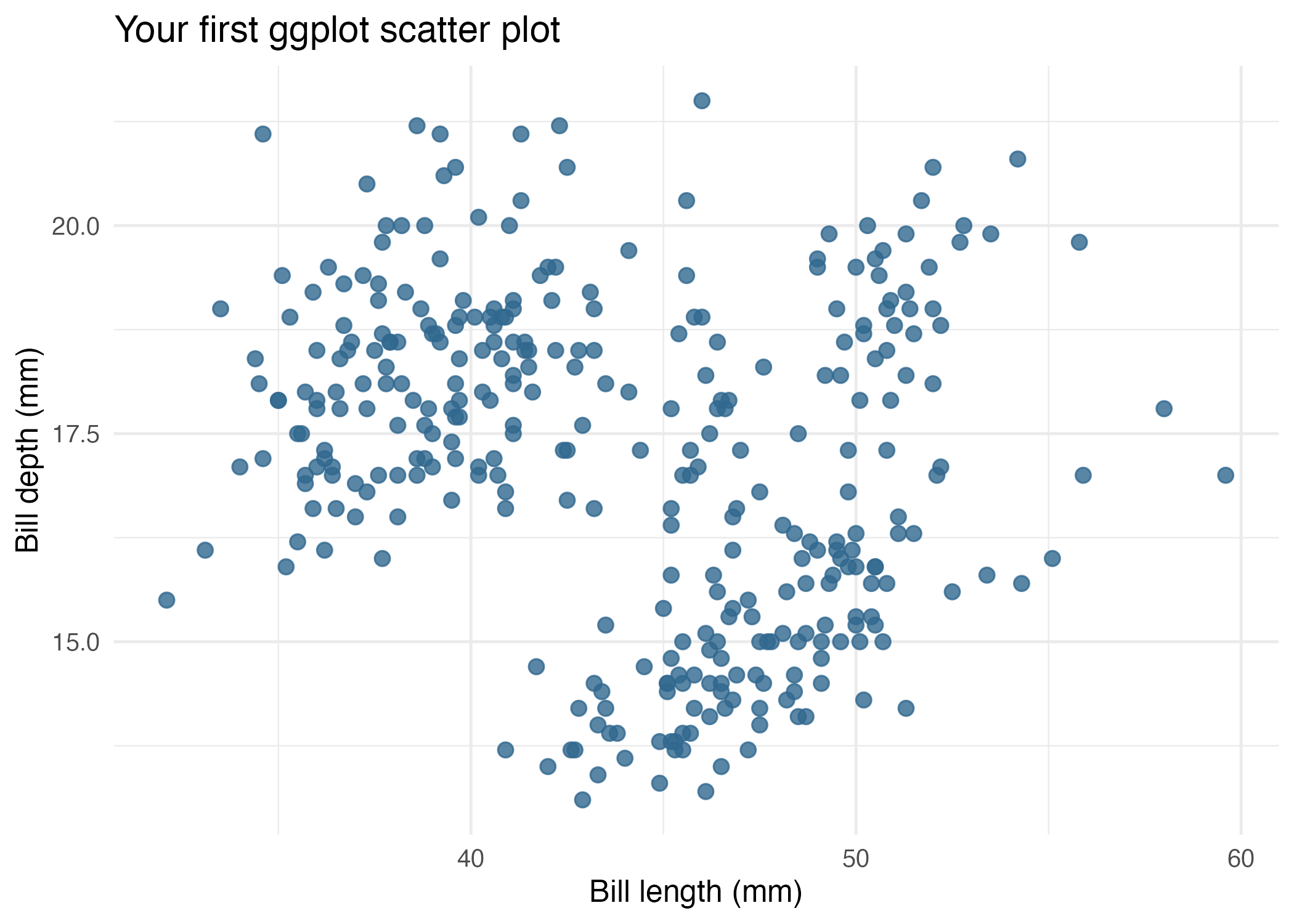
ggplot(
  data = penguins_clean,
  mapping = aes(x = bill_length_mm, y = bill_depth_mm)
) +
  geom_point()
This is the core pattern you should remember:
ggplot(data = ...)tells ggplot where the data comes from.aes(...)maps columns in the data to visual roles.geom_point()says you want points rather than bars, lines, or boxes.
Here is the beginner-friendly version generated by the companion script:
Step 3: Add One More Variable with Aesthetic Mapping
Once the first plot works, the next useful step is not “make it fancy.” It is “show more information clearly.”
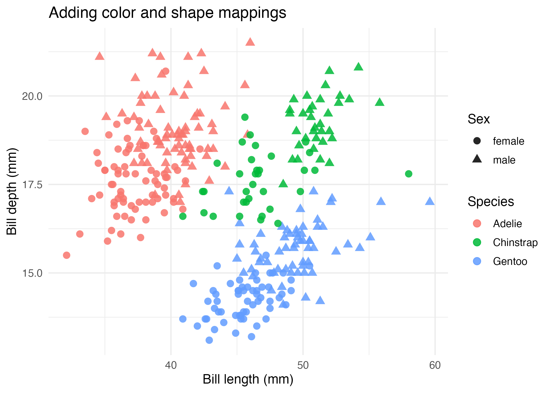
ggplot(
  data = penguins_clean,
  mapping = aes(
    x = bill_length_mm,
    y = bill_depth_mm,
    color = species,
    shape = sex
  )
) +
  geom_point(size = 2.8, alpha = 0.85)
This version maps:
speciestocolorsextoshape
That lets one plot carry more meaning without changing the underlying geometry.
Step 4: Understand the Smallest Mental Model
For this first article, keep the mental model small:
- Start with a data frame.
- Choose the columns you want to compare.
- Put those columns inside
aes(). - Add one
geom_*()layer.
If you remember only one thing today, remember this:
ggplot(data = ..., aes(x = ..., y = ...)) + geom_point()That line is the foundation for almost everything else in the series.
How to Confirm It Worked
- Your script runs without an error after
library(ggplot2). - You can print a scatter plot in RStudio or another graphics device.
- The companion script creates:
R draw/figures/01-first-scatter-basic.pngR draw/figures/01-first-scatter-mapped.png
Common Questions
Why start with a scatter plot instead of a bar chart?
Scatter plots are a very direct way to understand the grammar of x, y, and mapped aesthetics. They help you see the link between data columns and plot structure right away.
What is the difference between mapping = aes(...) and color = "blue"?
Inside aes(), you are mapping a variable from your data. Outside aes(), you are setting one fixed visual value for every point.
Do I need to write mapping = every time?
No. Many people write ggplot(data, aes(...)) as a shortcut. This tutorial keeps the explicit names first because they are easier for beginners to read.
Review Score
Score: 93/100 Verdict: This draft is ready for the tutorial queue and gives beginners a clean first win with ggplot2.
Show Explanation
Score Breakdown
- Accuracy: 23/25. The article teaches the canonical
ggplot() + geom_point()workflow and keeps the first explanation focused. - Beginner friendliness: 24/25. The mental model is intentionally small and the examples are not overloaded.
- Reproducibility: 24/25. A companion script and generated figures exist, and the data source is stable.
- Professional judgment and risk handling: 22/25. The article avoids early complexity, though later articles will still need to reinforce the difference between mapping and setting.
Review Notes
- Ready for human review.
- Before publication, add one console screenshot from the script run if you want the setup to feel even more guided.
```
Personnel
- ✍ Creator: Chenglin Cai
- 🤖 AI Collaboration: ChatGPT
- 🧪 Data Provider: palmerpenguins package dataset
- 💻 Code Contributor: ChatGPT